
Pantone Color of the Year 2019: Living Coral PMS#16-1546
Pantone has announced the Pantone Color of the Year 2019: Living Coral PMS#16-1546. In the design world, we also refer to this as a PMS#, my clients always have a good laugh when they hear this term for the first time. PMS stands for Pantone Matching System, You are now wondering what is the big deal about Pantone?
As a graphic designer we use the Pantone Matching System when designing a logo, we choose colors from the Pantone book. What makes this system perfect is when I give my printer the PMS#, he will have the PERFECT matched ink to use that matches the Pantone color that was designed for the logo. Pantone has different color systems for many applications such as printing for paper products, silk-screening onto garments, textiles, cosmetics, plastic and much more. When it comes to consistent branding for your company, its important that the colors in your logo are consistent from your business cards, to your promotional products to your logoed ball caps. Pantone has created this universal language in color that is interpreted to consistent branding.
“I believe Pantone Color of the Year sets the tone for the year and opens up the creative world to a fresh new look.”
This is always an exciting time for all of us designers, this color is the trending color. You will see this color on everything from fashion, interior design, kitchen products, paints, electronics, and the list goes on and on. These colors are always an announcement of what the up and coming trends are coming for the year. As a designer, we love this!!! We start infusing these colors into our designs and products. I believe it sets the tone for the year and opens up the creative world to a fresh new look.
“The power of color bring us back to a good time in our lives, brings feelings and emotions that we may have forgotten. ”
Why is the Pantone Color of the Year so important? It changes the look in the stores we walk into, it influences the products that we purchase. It changes the feeling in our homes to whisper a fresh change of hope, creating a new pallet in our lives. Looking back at previous years of the Pantone Color of the Year, it stirs reminisce memories of fondness to a favorite purse or garment. The color brings us back to a good time in our lives, brings feelings and emotions that we may have forgotten. Here is a look back to previous colors:
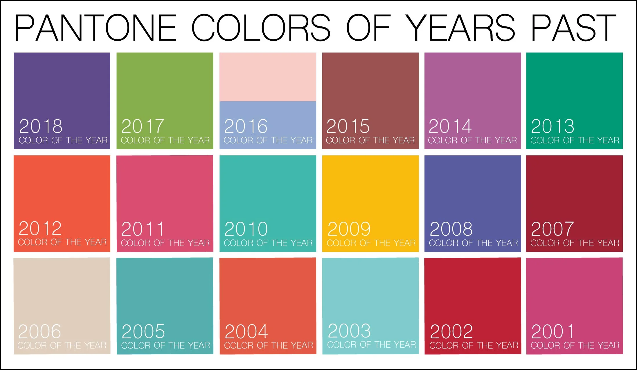
As I look over these past colors, they bring back memories of important events in my life. Some of the years reflect more than others of what was going on in our world around us. The power of color can never be underestimated, it makes our lives a lot more colorful.